
Value‑Driven Dashboard
Introducing gamification to boost long‑term user engagement
3. The challenge
The app didn’t clearly communicate progress to the users or highlight the value they were gaining over time. They had little motivation to return regularly or explore additional tools. The experience felt transactional rather than rewarding. Which directly affected long‑term engagement and retention.
Another major challenge was the technical complexity behind the solution. Also the fact that we were working with multiple technical constraints. And wide range of use cases and several distinct user personas. This required from me to be extremely careful when designing the user flow and mapping the logic behind the savings calculations and reward triggers. Every step had to be technically feasible, scalable and intuitive for users with different levels of experience.
Me and the team spent significant time aligning with engineering. So we could have a clear view on the system limitations, data availability and edge cases. This ensured that the final experience not only looked simple and seamless but also worked reliably across all scenarios. Balancing user needs with technical realities became a key part of shaping a solution that was both meaningful and implementable.
2. My role
My role was to lead the entire ideation process, leveraging my deep knowledge of the app and its existing design patterns. I participated in early brainstorming sessions, coordinated closely with PMs and technical teams. I presented the initial concept to the leadership board.
Together with the product team, I helped define the savings (dashboard) logic. We did that by combining our domain expertise with the input from engineering and the available data. Once we aligned on the core behavior, I took ownership of creating the visual concepts, interaction flows and prototypes that shaped the user experience.
After visualizing the solution, I presented the designs to the technical teams. Worked closely with engineering to validate feasibility, refine calculations and ensure a smooth implementation. This collaboration was essential for translating the concept into a reliable, user‑friendly feature.
1. Overview
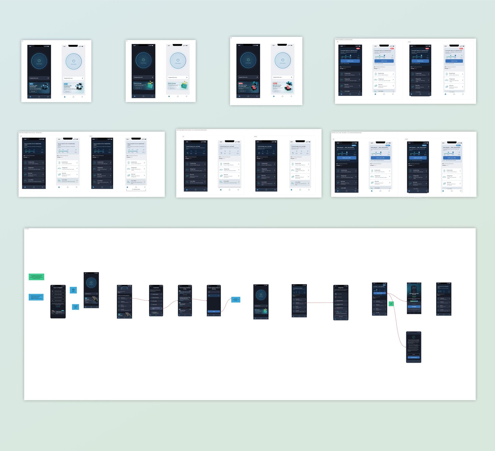
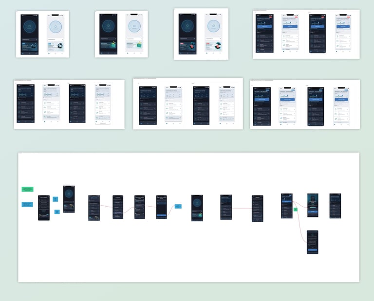
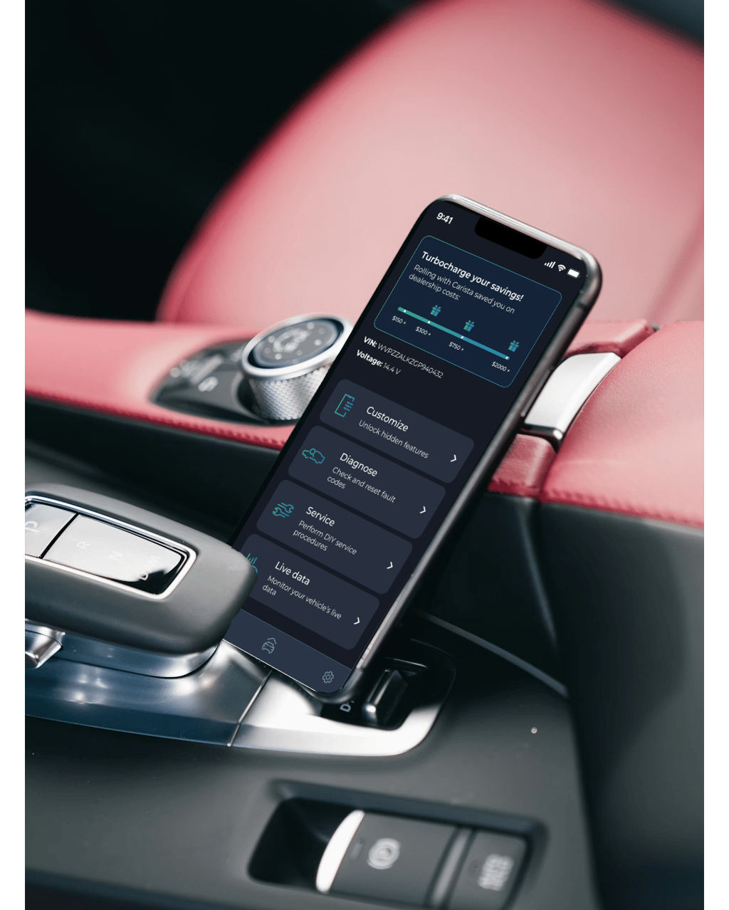
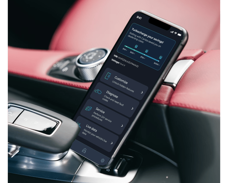
Our product team was tasked with improving user retention in a car‑maintenance app. Research showed that users weren’t fully aware of the value they were getting from the app’s features. Which led to low engagement and churn. To address this, I designed a new dashboard that visualizes how much money users save by using the app - turning invisible value into a motivating experience.
4. Impact
The introduction of the savings dashboard had a measurable impact on how users interacted with the app. By finally giving them a clear, tangible reason to return. We significantly increased overall retention.
This naturally boosted engagement with the app’s core features. Because each feature contributed to their total savings, users were more motivated to explore and use tools they had previously ignored. The experience shifted from task‑based to value‑driven, creating a positive loop. Where the more users engaged, the more they saved and the more they wanted to continue. Instead of feeling pressured to upgrade, users felt rewarded for their ongoing engagement. This turned the subscription into a meaningful achievement rather than a barrier.
Overall, this feature strengthened the perception of the app’s long‑term value.
I designed a savings dashboard that:
Calculates how much users save based on the car‑maintenance features they use;
Displays savings in a simple, motivating visual format;
Introduces a progress bar that grows as they save more;
Unlocks a subscription incentive once they reach a specific savings milestone.
The dashboard reframed the app’s value proposition. It transformed the app from a utility into a value‑tracking experience. This sense of progress and reward became a key driver of ongoing engagement and the gamification effect made the users eager and interested into continue using it.
5. Outcome
Problem identification & user value gap
Define concept of a dashboard and gamification
Create logic, flows with product and engineering teams
Design UI, interactions & prototypes
Engineering alignment & delivery support

Contact
Interested in working together? Let's chat about it.
© 2026. All rights reserved.